parismo
backThree links, one logo, and a VHS tape that throws films at you.
- client
- Parismo, Sheffield
- what I did
- Design, build, tape graphic
- built with
- Shopify, Liquid, vanilla JavaScript
- live at
- parismo.uk

the brand
Parismo is an underground streetwear brand from Sheffield, run by three lads who are also exactly who they are selling to. They had a standard Shopify theme that did the job and said nothing about them. What they did have was years of their own footage, shot on whatever was to hand, sitting on a page as a plain list of videos.
So the rebuild was built around the tapes.
a homepage with three links
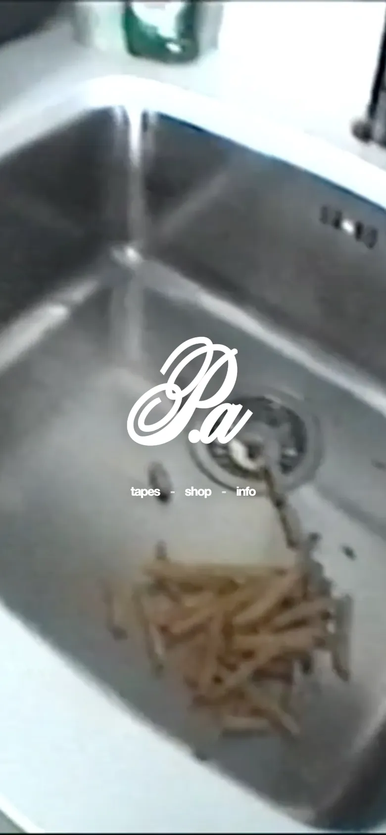
The homepage is a portal, not a shop window. One of their tapes plays full screen, picked at random each visit, with a solid white logo over it and three words underneath: tapes, shop, info. No banner, no slideshow, no newsletter popup. If you know the brand, that is all you need. If you do not, the footage tells you faster than a paragraph would.
the tapes page
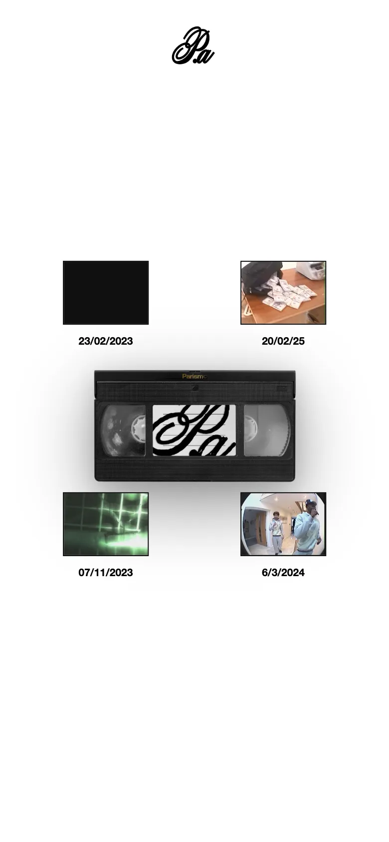
This is the part people send to each other. A VHS cassette floats in the middle of a white page. I made the tape graphic myself, with their logo on the label. Hover it, or tap it on a phone, and every brand film bursts out around it as a thumbnail with its date. Click one and it plays full screen.
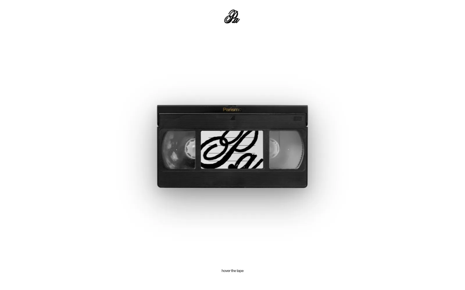
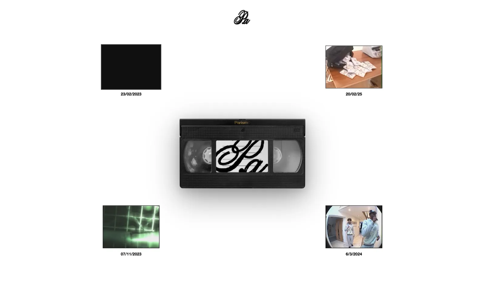
It went through a few rounds. The first version was black. The client wanted it white to match the shop, so the whole page flipped: black logo, black cursor, white player. Their word for the final version was perfect.
the shop
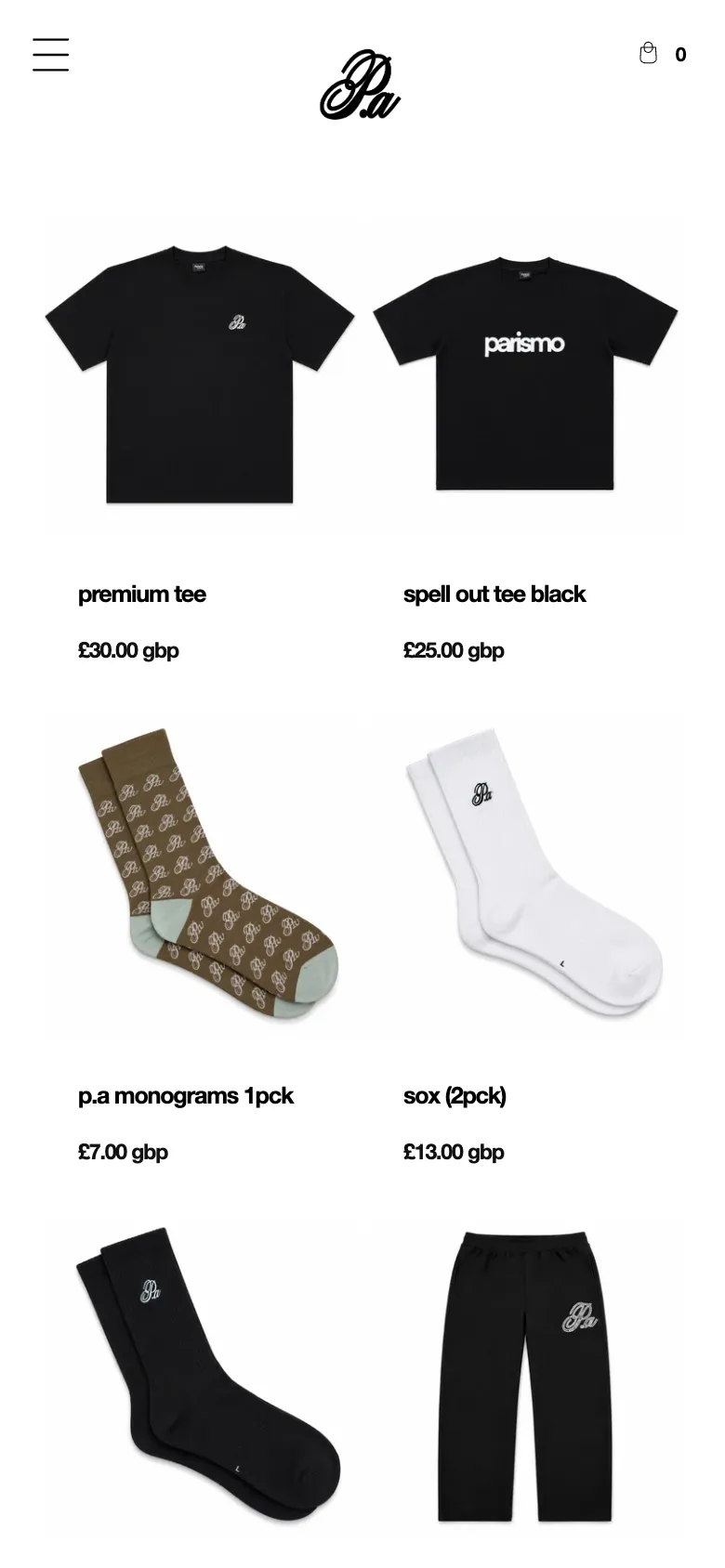
Everything in the shop is set in bold lowercase Helvetica with tight tracking. It sounds like a small decision. It is the whole voice of the brand, and it runs through every page, button and price.
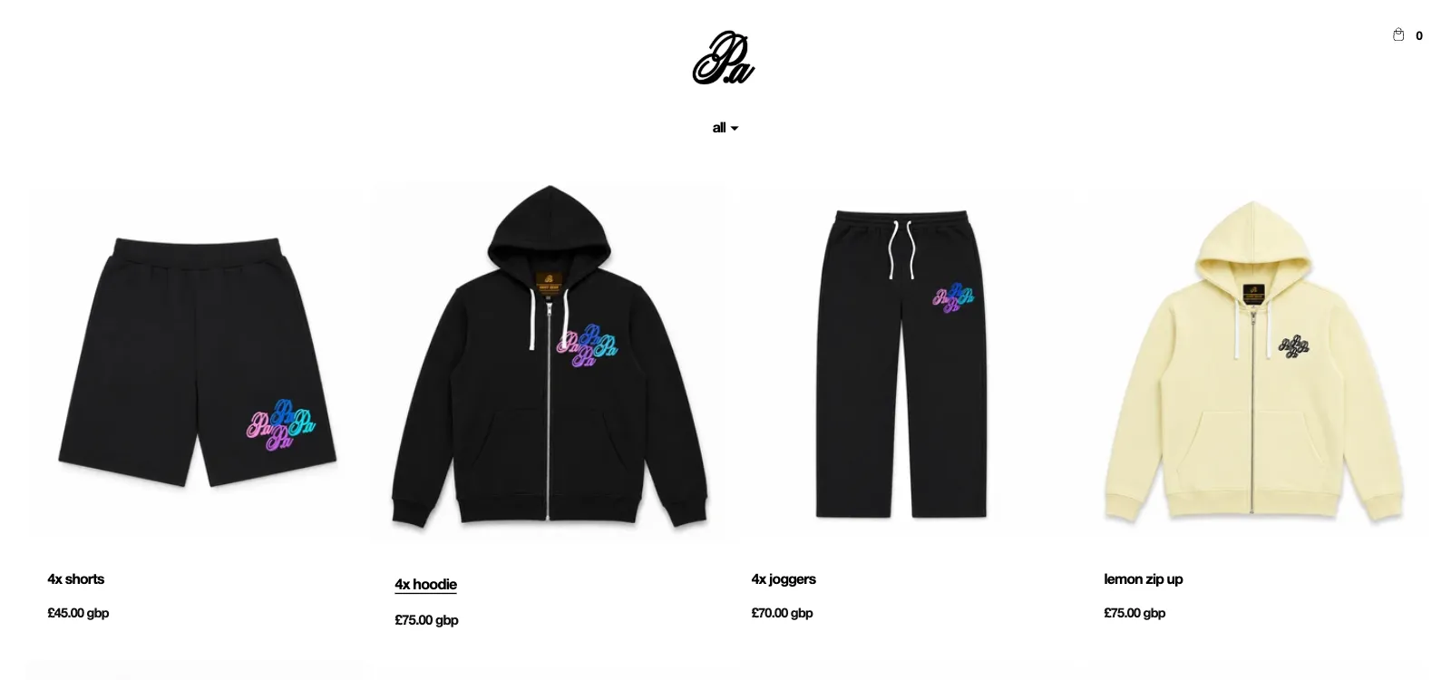
- A cursor that is theirs - a star, white over the films and black over the shop, swapping depending on what is underneath it
- Cards that pop - products lift slightly on hover. The client did not like a second image swapping in, so it was taken out
- Pages that crossfade - moving around the site fades between pages instead of flashing white, using a feature built into modern browsers rather than a heavy script
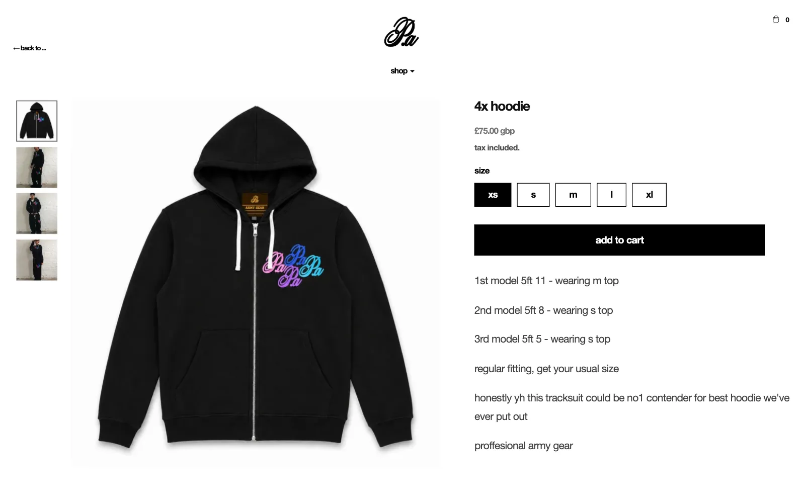
- A back link that remembers - product pages know which collection you came from and send you back to it
on a phone
The menu becomes a full-screen white overlay, the shop goes to two columns, and the tape opens with a tap.
built so they can run it
Three people run this brand between everything else they do, so the site had to look after itself:
- New tapes are added in the Shopify editor and appear around the cassette automatically
- The info page lists their shop policies by itself, so there is one place to update them
- The homepage shop link always opens on the newest products, with nothing to repoint after a drop
- Cart, search, contact and 404 were all rebuilt to match, so no page falls back to the old theme
what this shows
The best thing on this site was already theirs. The job was to notice that the footage was the brand, then build a store that gets out of its way. That is most of what good Shopify design is: finding the thing a business already has that nobody else does, and putting it where people will see it.
start a project see all the work →